
Fashion Colors 2026 Spring/Summer: The Key Shades of the Season
- Burak Odev
- Aug 12
- 5 min read
According to WGSN and Coloro, the fashion colors for 2026 Spring/Summer represent a world at a turning point. Consumers are seeking balance between optimism and realism, between heritage and innovation, and between emotional depth and visual boldness. This year’s color palette is not just about trend cycles. It reflects a deeper cultural mood, influenced by environmental awareness, digital creativity, and a renewed focus on personal well-being.

The five shades chosen for Spring/Summer 2026 are more than just attractive tones. They are narratives in color, capable of anchoring entire collections and brand stories. They can be used individually for a strong seasonal identity or combined to create layered, versatile palettes that work across seasons.
The Five Defining Fashion Colors of 2026 Spring/Summer
According to WGSN’s trend analysts, the color direction for 2026 is defined by its ability to connect with people on an emotional level while still delivering strong visual presence. This year’s palette balances high-impact statement shades with grounding, restorative tones. Each hue tells a story, whether it’s about resilience, optimism, calm, or self-expression, allowing brands to design with both meaning and style. Colors are no longer chosen just for aesthetics; they are selected for the feelings they evoke, the values they represent, and the cultural narratives they carry.
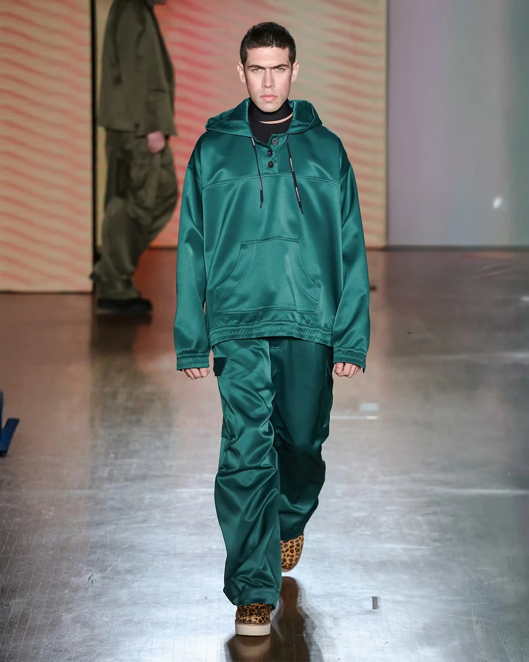
Transformative Teal
This is the anchor color of 2026 and has been named Color of the Year by WGSN and Coloro. A deep fusion of blue and green, it speaks of renewal, balance, and ecological awareness. It feels rooted in nature yet futuristic enough to suit modern fashion directions.

Design Use: Transformative Teal adapts easily to both fluid, draped silhouettes and structured tailoring. It works well in satin for eveningwear, in cotton blends for daywear, and in performance fabrics for activewear.
Pairing Suggestions: Pair with earthy browns and stone neutrals for a grounded, sustainable feel, or with crisp white and citrus yellow for a fresh, summery twist.
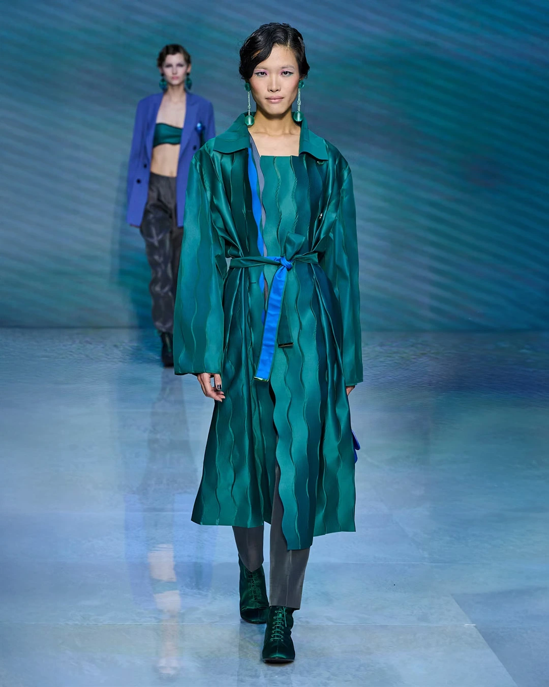
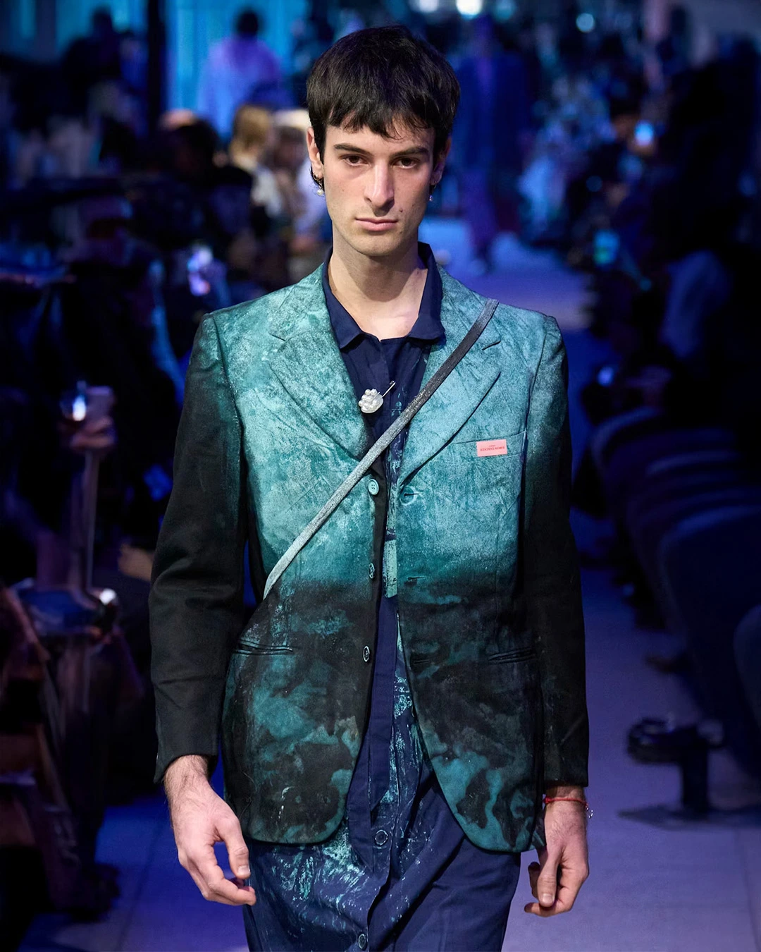
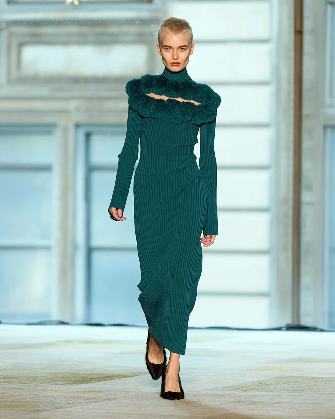
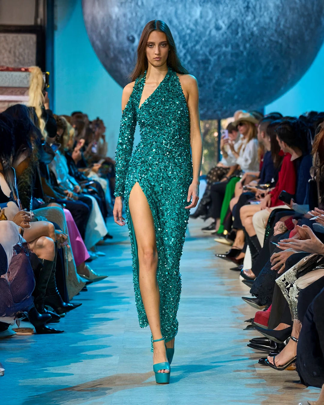
Final Thought: This shade has long-term staying power. Brands can use it as a signature tone across multiple seasons, giving their collections both consistency and cultural relevance.
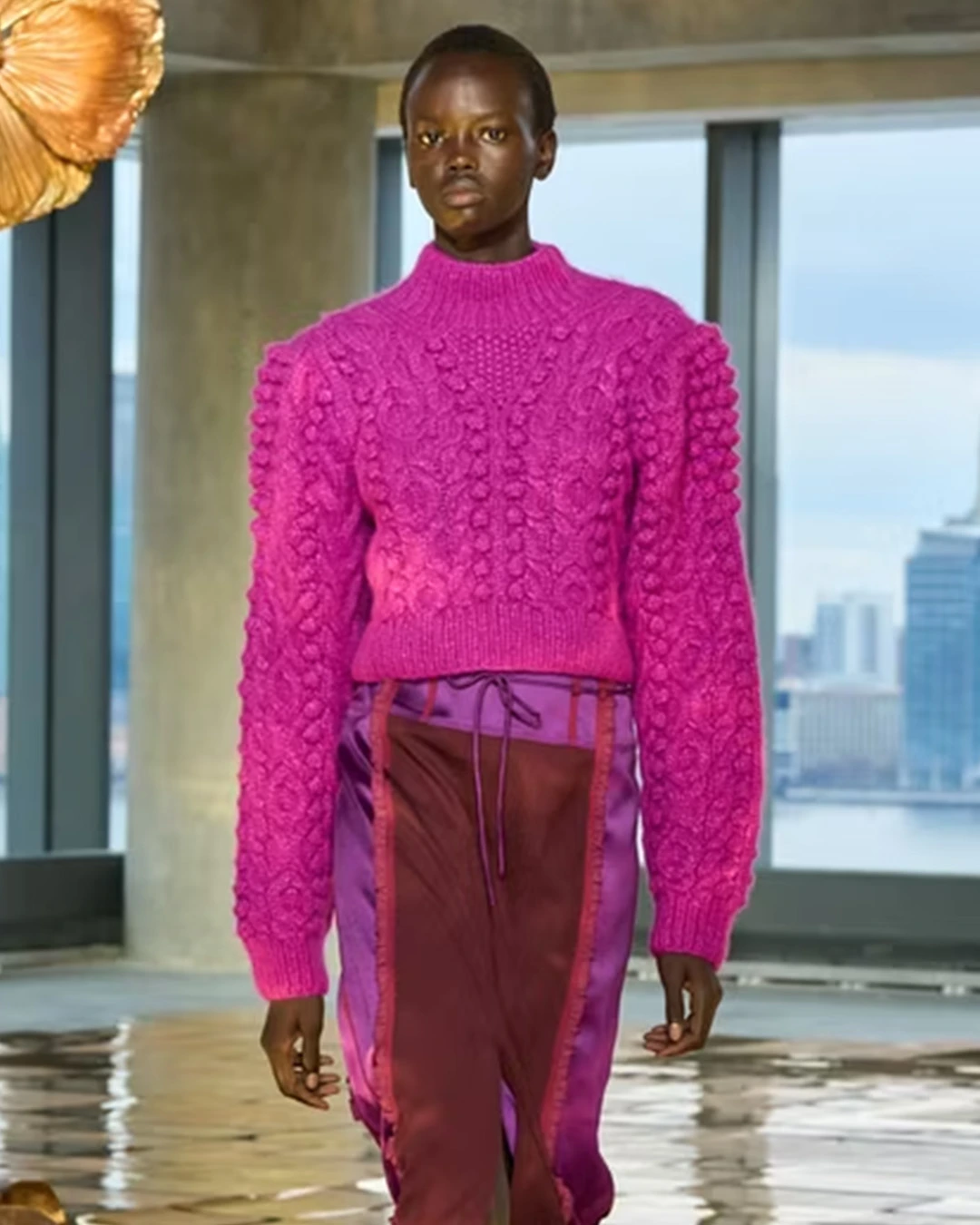
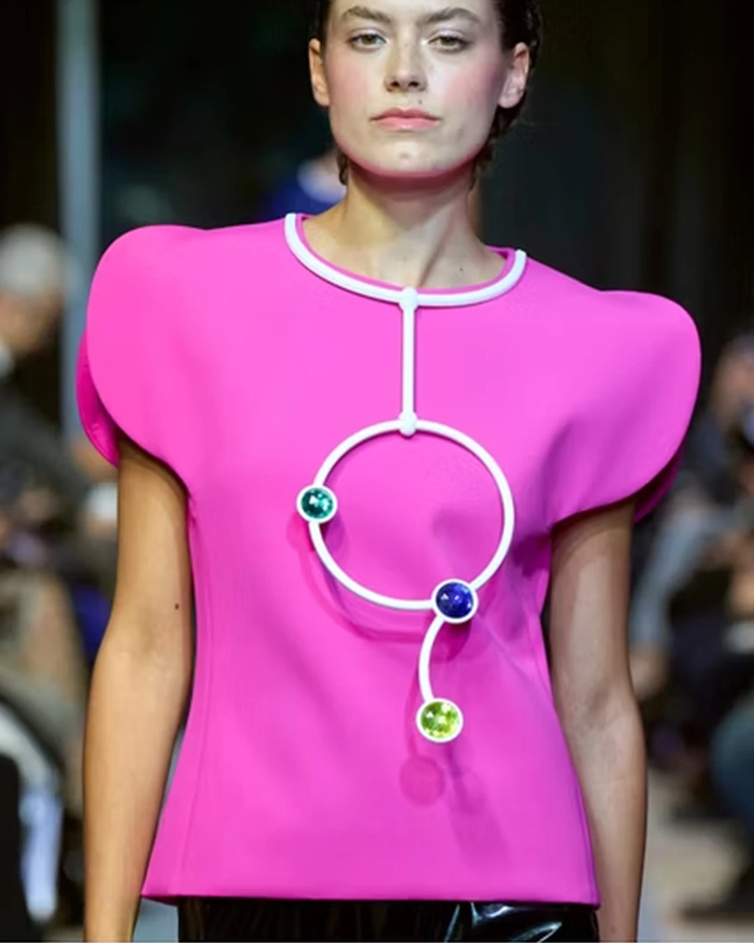
Electric Fuchsia
A vivid pink-purple hybrid that radiates energy and confidence. It embodies the spirit of digital culture, maximalism, and expressive individuality. Electric Fuchsia is unapologetically bold and thrives in environments where visibility is key.

Design Use: Ideal for statement dresses, streetwear drops, and high-impact outerwear. It also works as an accent in trims, linings, and accessories to inject a pop of excitement into a neutral outfit.
Pairing Suggestions: Combine with black for an edgy, urban look, or with mint green for a playful, high-fashion contrast. Metallic silver also enhances its futuristic character.
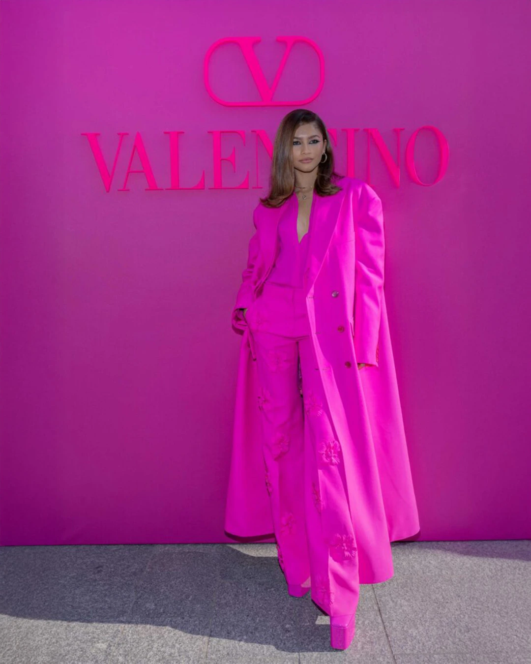
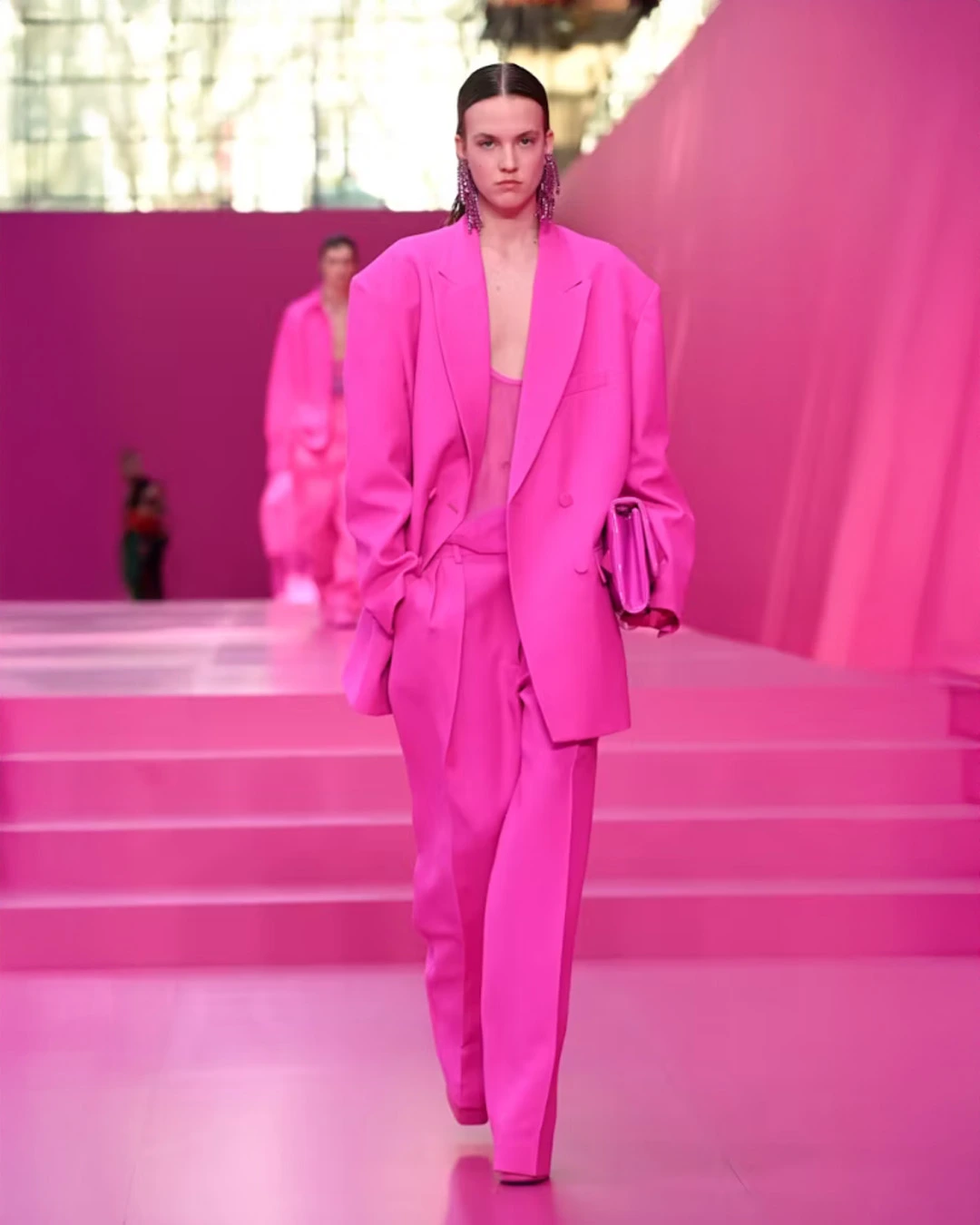
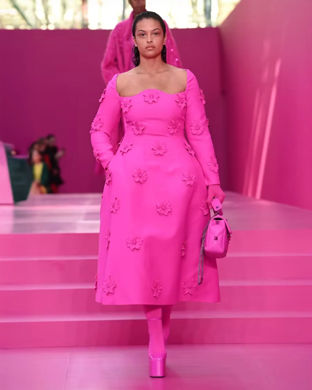
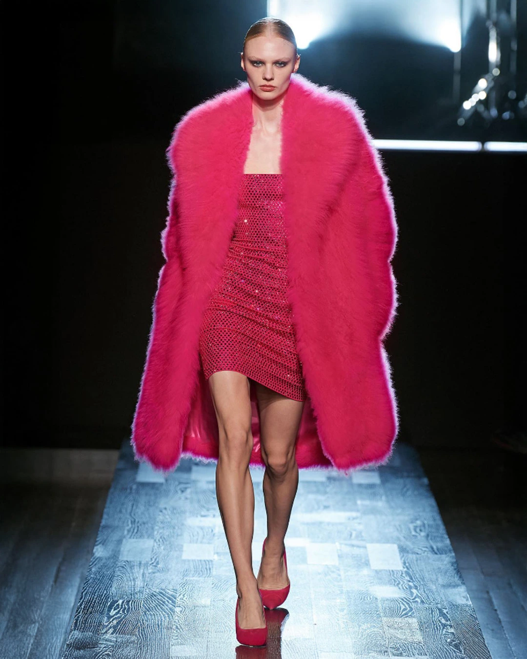
Final Thought: Electric Fuchsia is not a background color. It’s a headline-maker that can turn simple garments into focal points. For marketing, it delivers maximum impact both in person and on digital platforms.
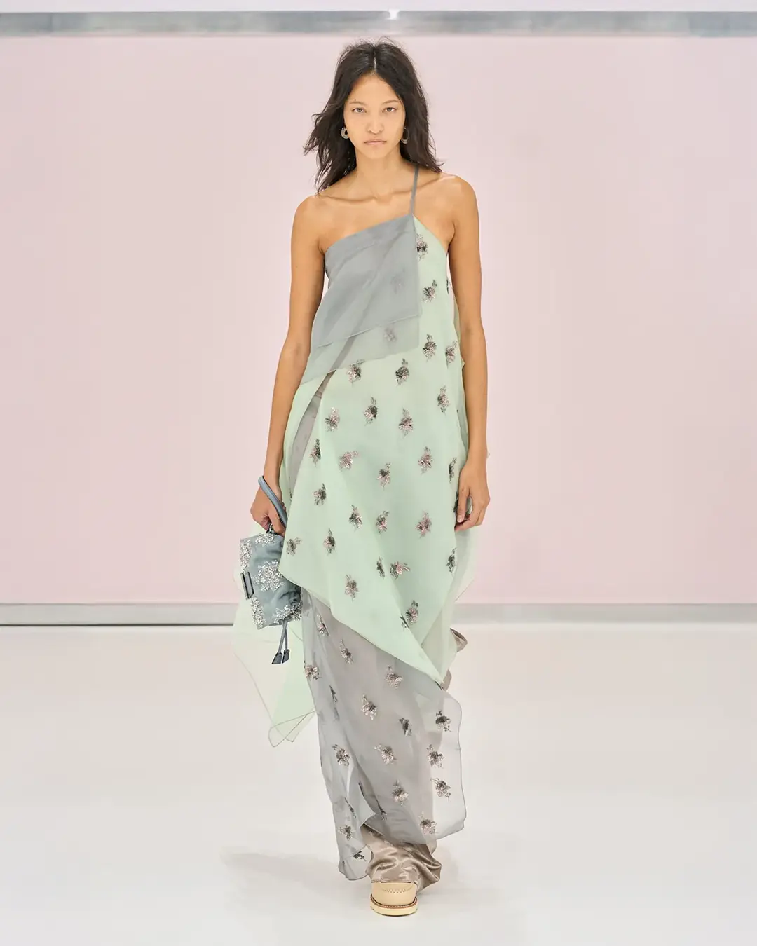
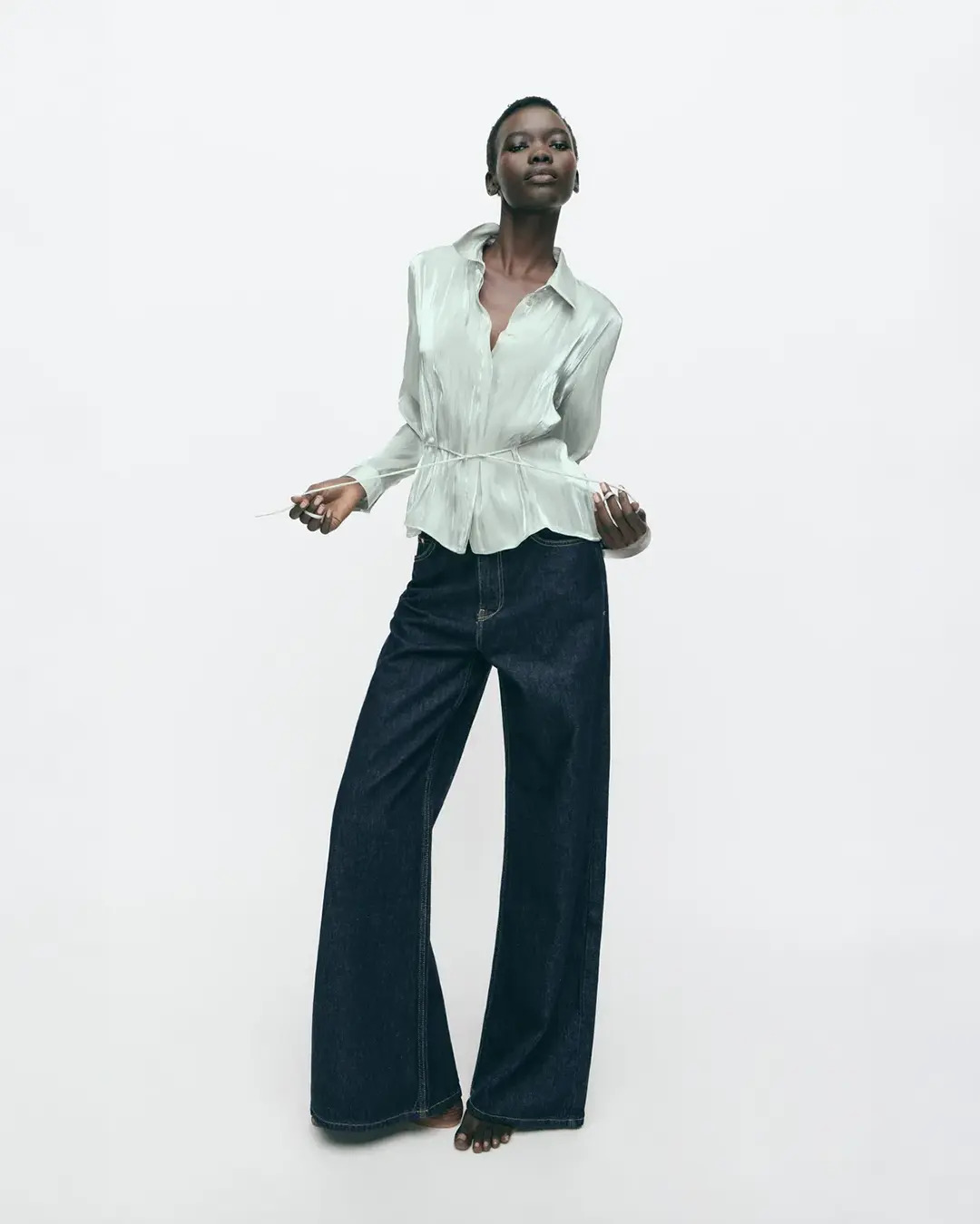
Blue Aura
A soft pastel blue with a subtle grey undertone that creates a serene, contemporary feel. It embodies calmness, trust, and clarity, making it one of the most versatile shades in the 2026 palette.

Design Use: Blue Aura works across categories, from romantic silk dresses to minimalist suiting to lightweight sportswear. It’s equally effective in matte finishes for a natural look and glossy coatings for a modern twist.
Pairing Suggestions: Works beautifully with cream, light grey, and beige for a soft, timeless mood. For more contrast, combine with amber tones or deep navy.
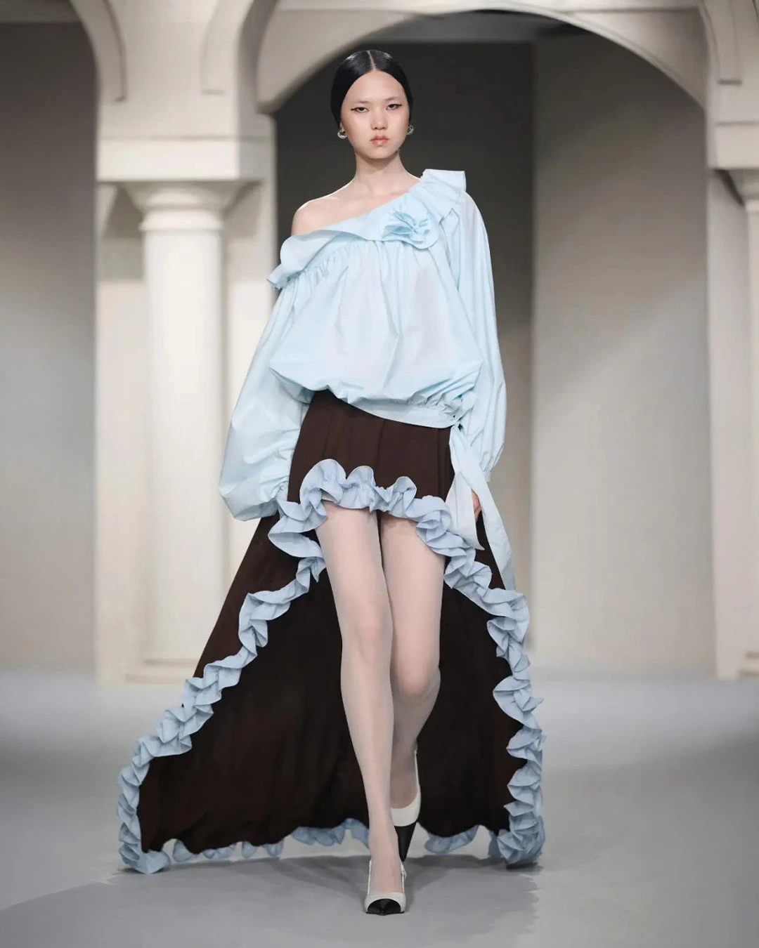
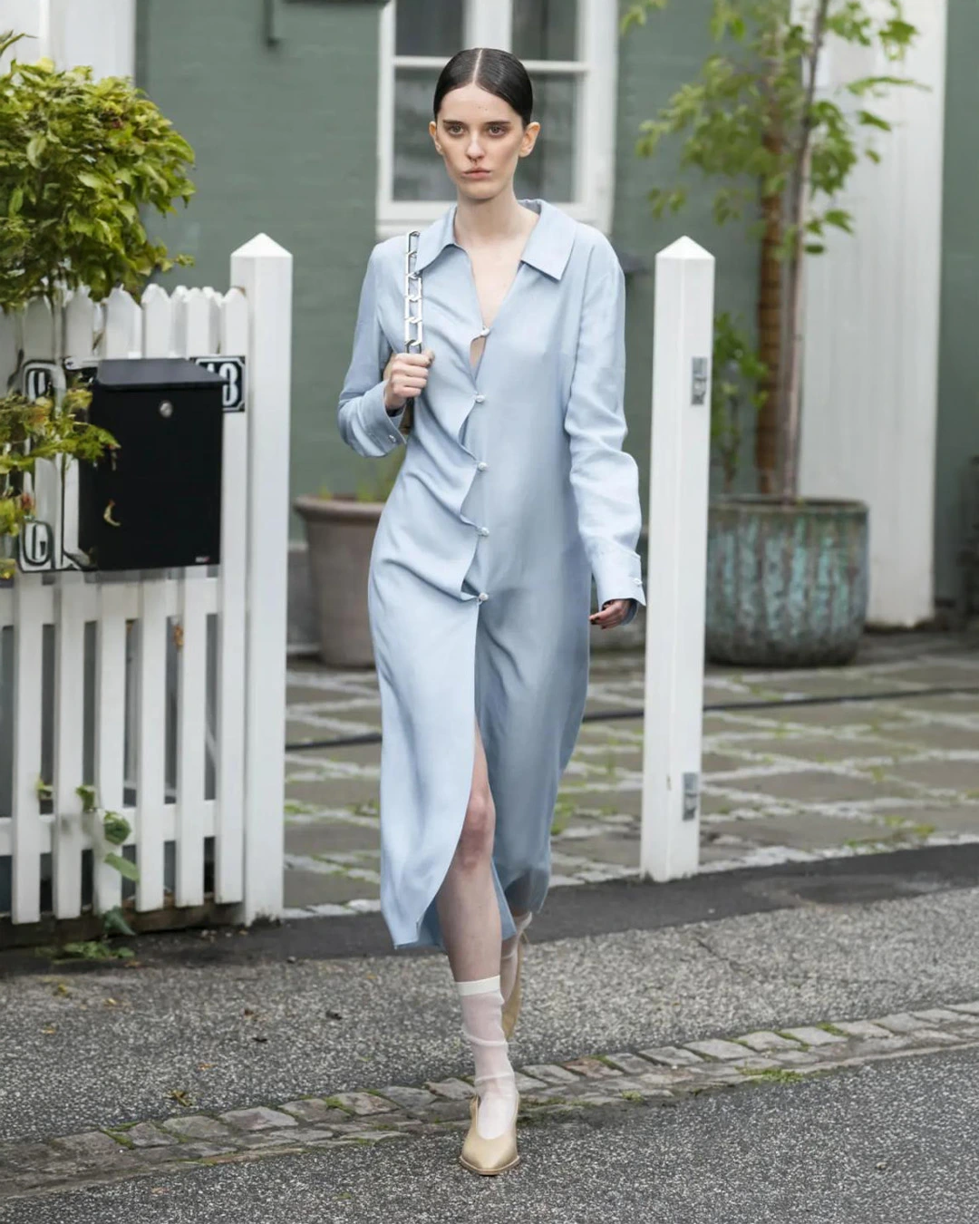
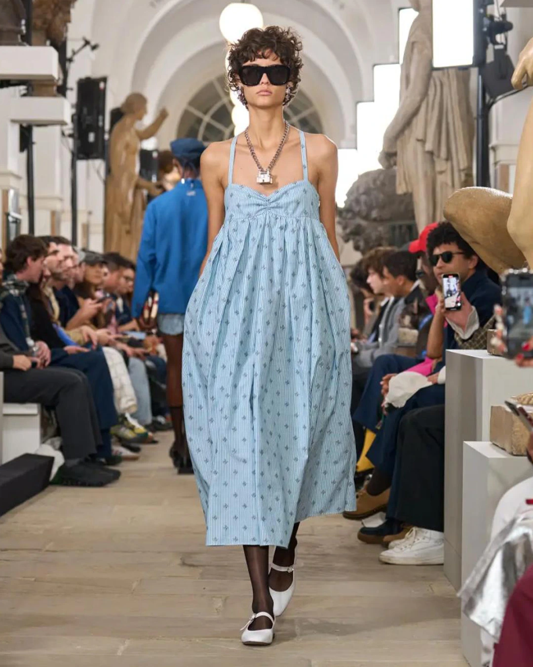
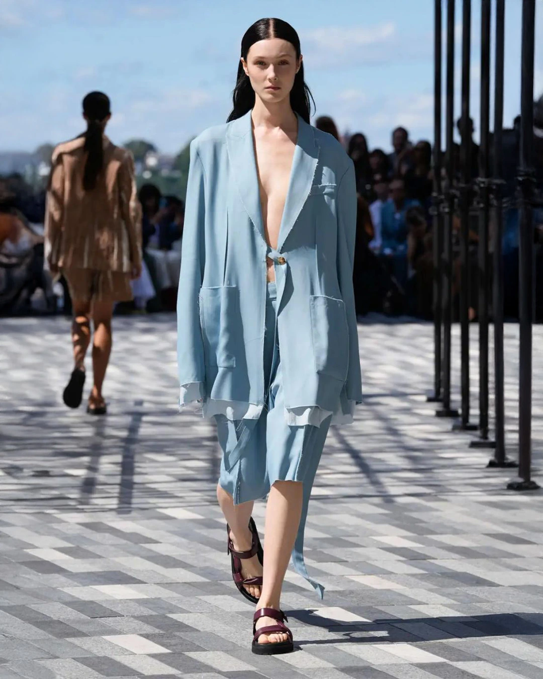
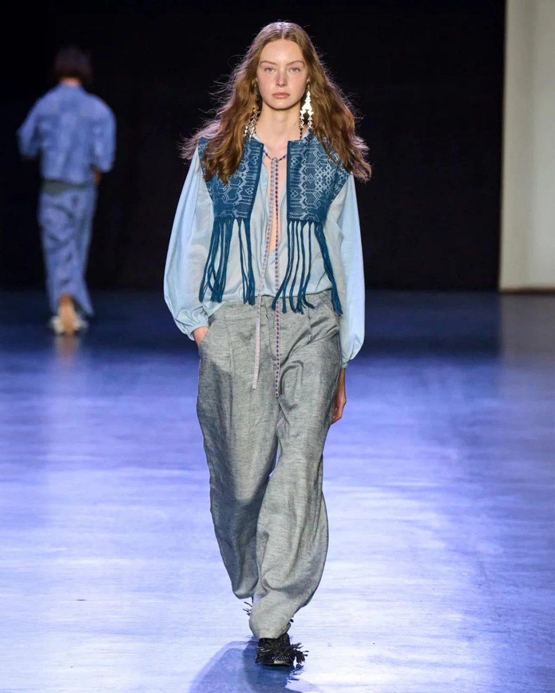
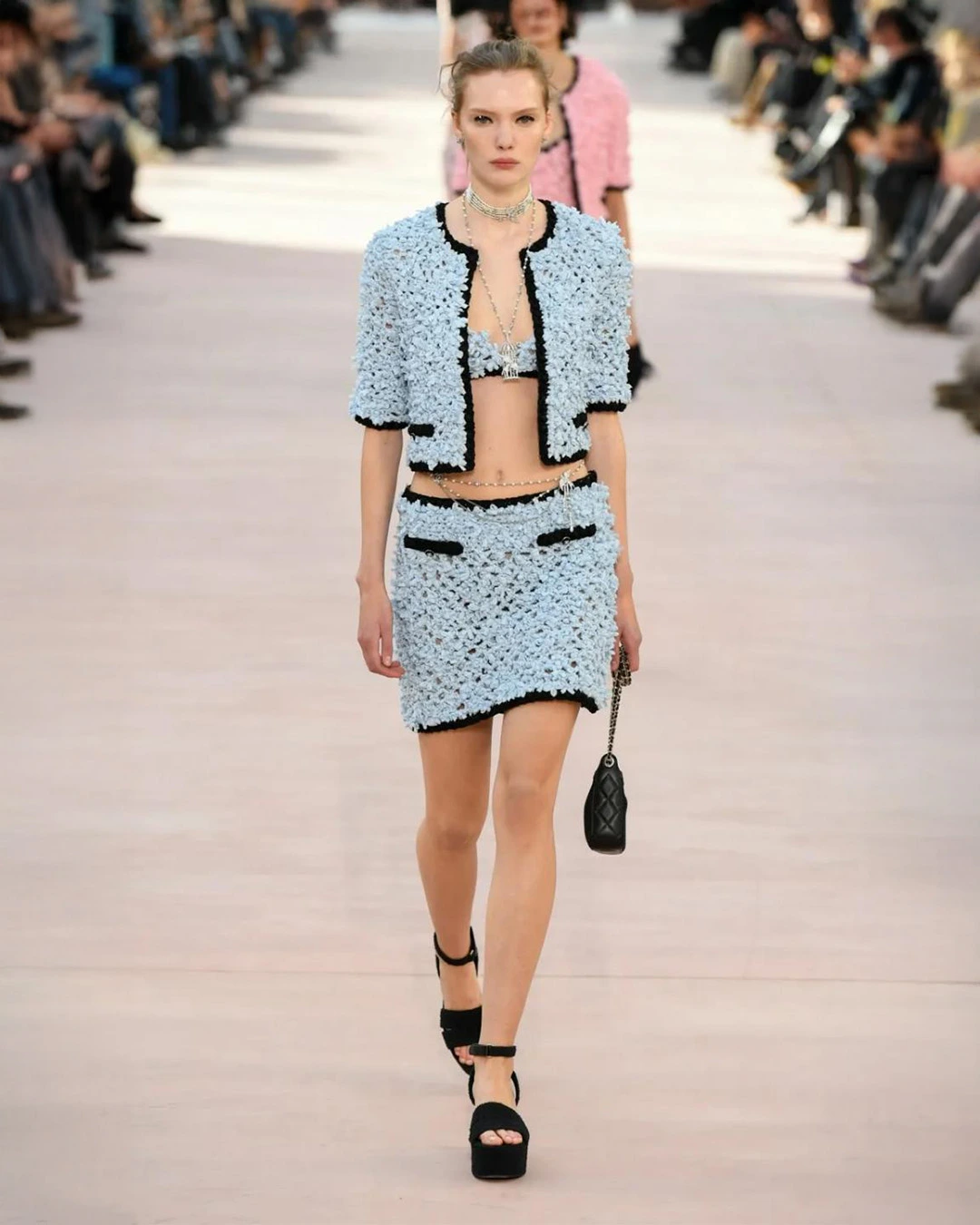
Final Thought: This is a shade with commercial appeal that will age well. It bridges the gap between everyday wearability and runway elegance, making it valuable for brands looking to maintain relevance over multiple seasons.
Amber Haze
A warm golden yellow with hints of olive green, evoking sunlit landscapes and artisan craft traditions. It speaks of heritage, comfort, and connection to the earth.

Design Use: Perfect for linen dresses, woven knits, and outerwear. It shines in textured, tactile fabrics that showcase its depth. Works well in accessories like belts and shoes to add richness to a look.
Pairing Suggestions: Combine with rich browns and deep greens for a grounded, natural look. For a modern contrast, pair with pale blue or light pink.
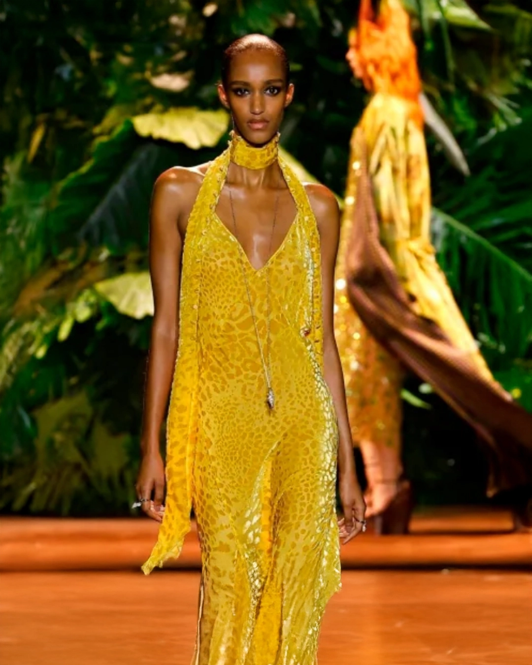
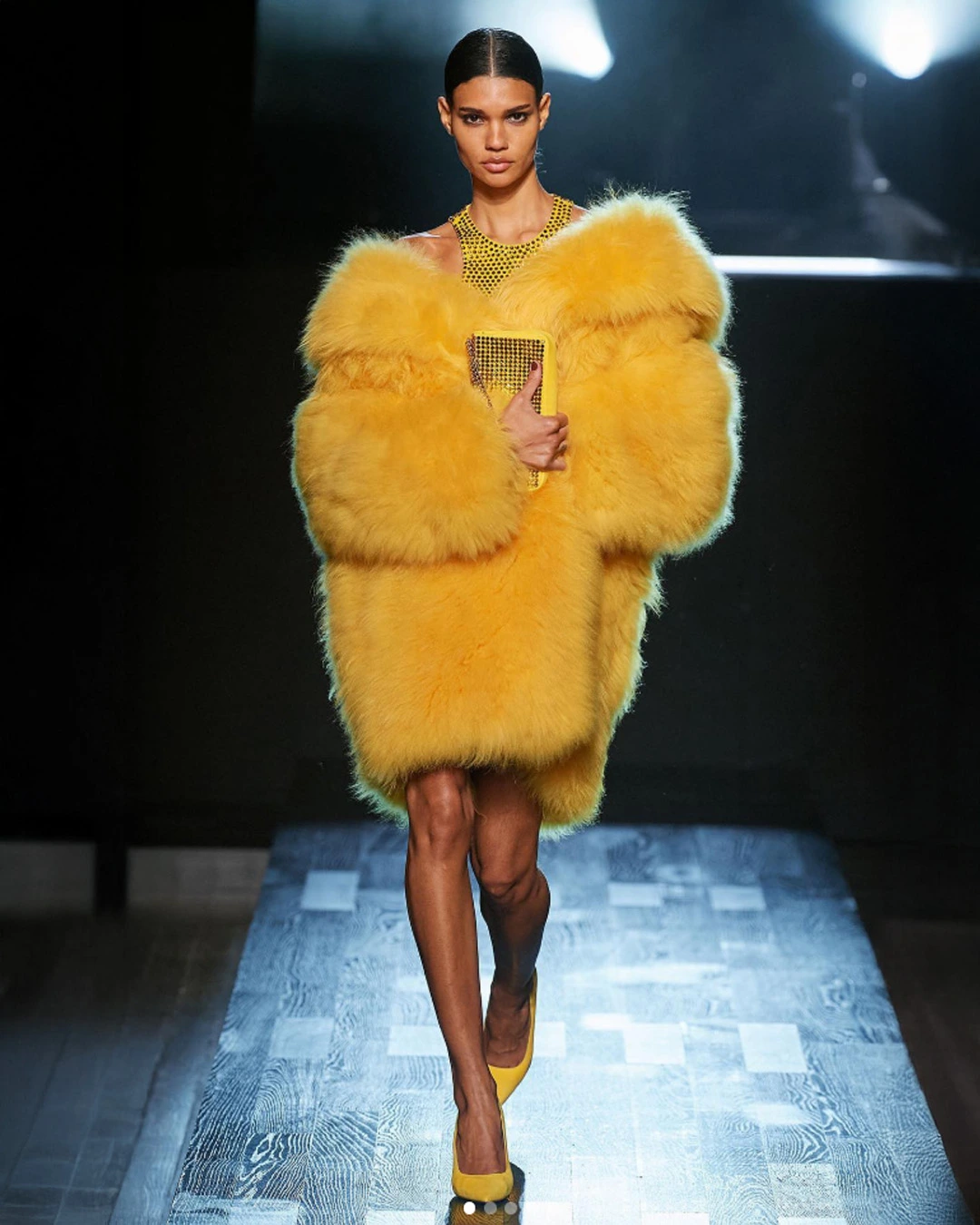
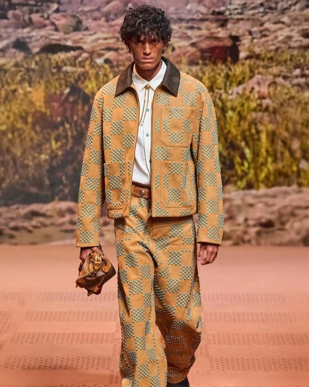
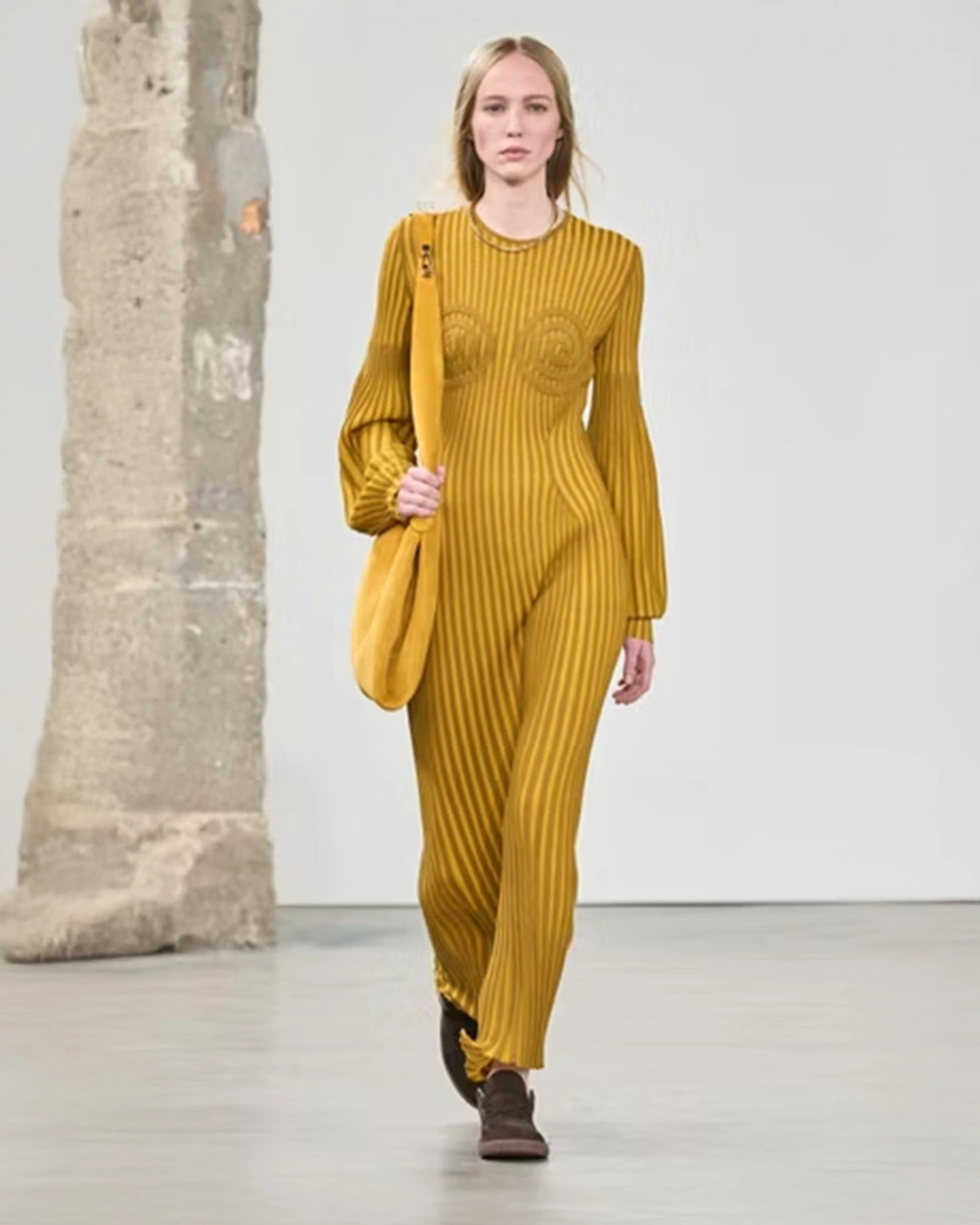
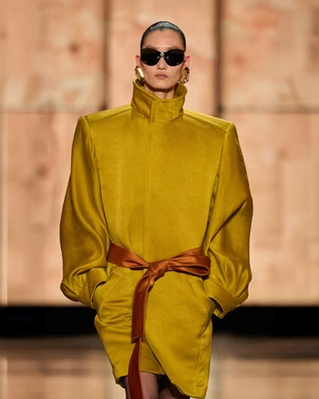
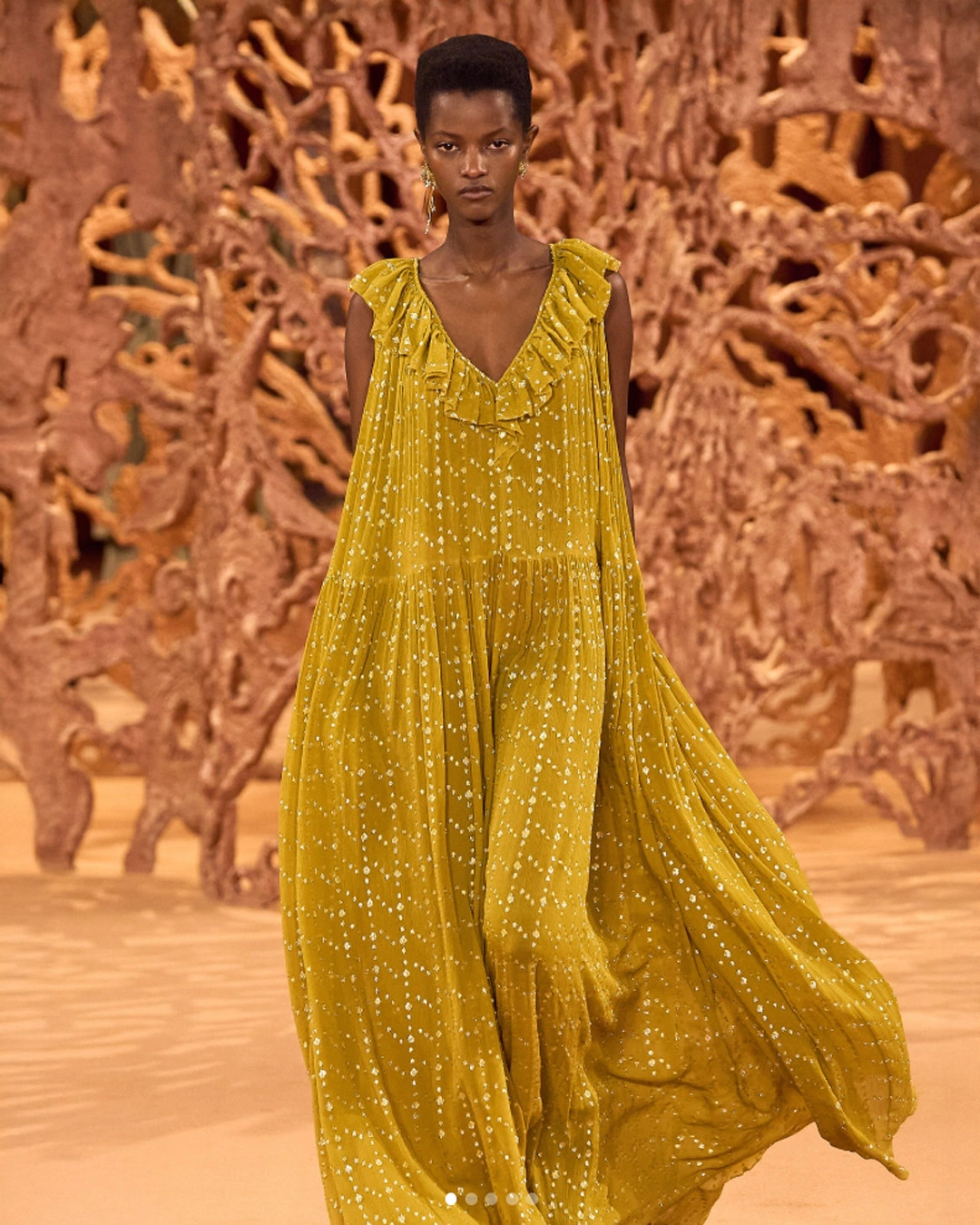
Final Thought: Amber Haze has a rare ability to feel both traditional and contemporary. It gives collections a warm backbone that works equally well in spring and autumn.
Jelly Mint
A pastel mint green that is fresh, playful, and slightly nostalgic. It reflects a yearning for joy, lightheartedness, and micro-moments of happiness in an overstimulated world.

Design Use: Ideal for casual summer dresses, layered streetwear, and youth-driven accessories like sneakers or handbags. It can be used in sheer fabrics for softness or in rubberized finishes for a trend-led edge.
Pairing Suggestions: Matches perfectly with soft pastels like blush pink or lilac for a romantic look. For more energy, combine with Electric Fuchsia or cobalt blue.
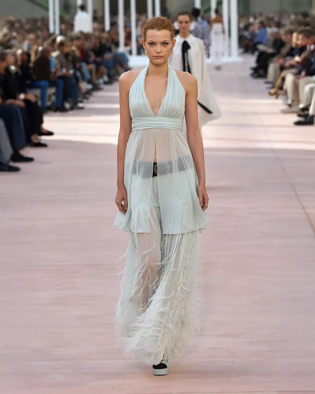
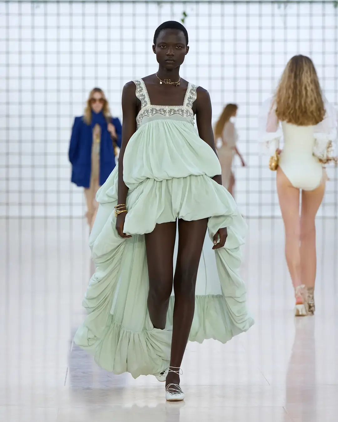
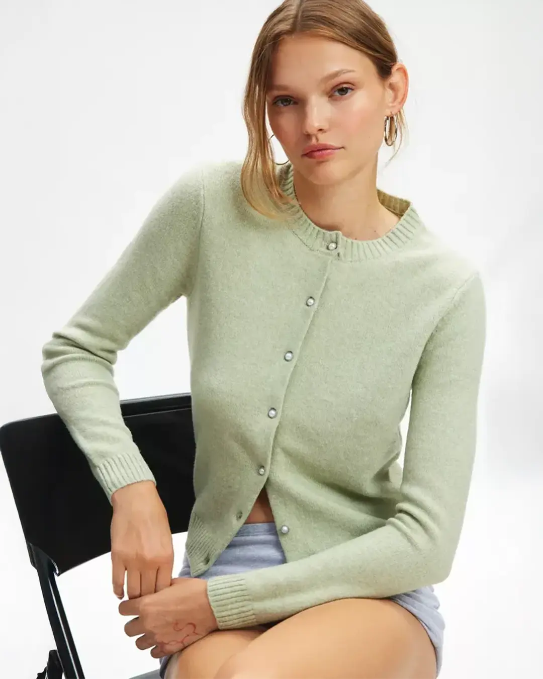
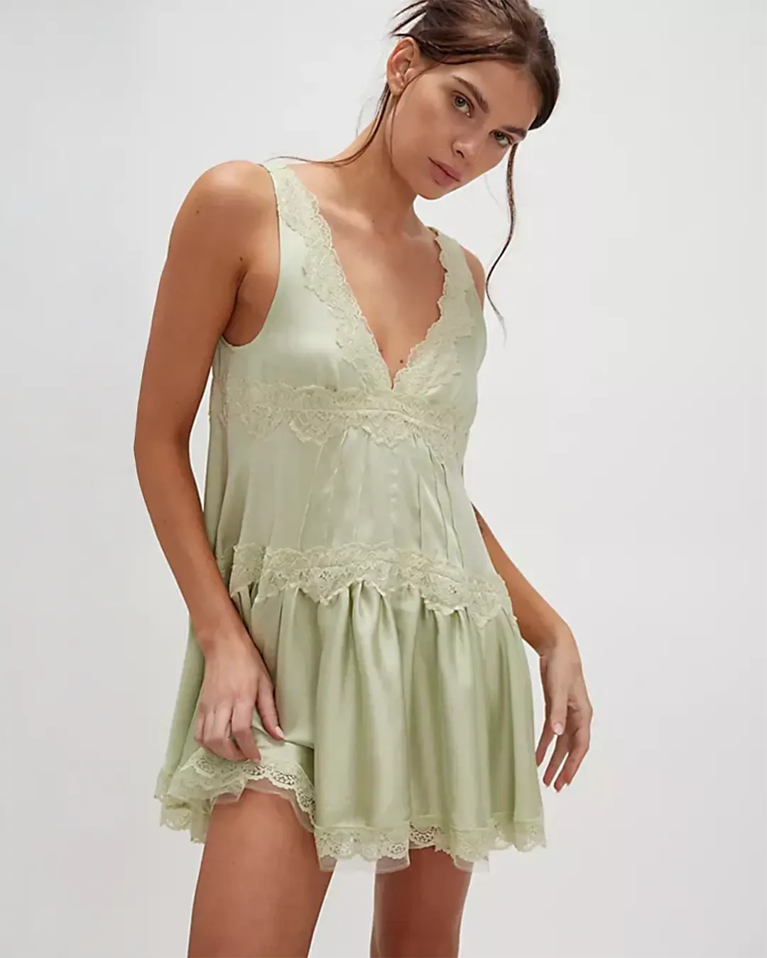
Final Thought: Jelly Mint is an instant mood booster. For brands targeting Gen Z and younger Millennials, it’s a way to signal fun and freshness while still maintaining sophistication.
The Emotional Power of WGSN Key Fashion Colors of 2026 Spring/Summer
WGSN’s analysts note that color in 2026 is as much about emotional connection as visual presence. The palette blends statement shades with grounding tones to suit both bold expression and quiet elegance.
Consumers want colors that reflect their values, support their self-image, and inspire confidence. This year’s palette offers something for every emotional state:
Transformative Teal for balance
Electric Fuchsia for self-expression
Blue Aura for calm
Amber Haze for grounding
Jelly Mint for joy.
Why These Colors Matter for Brands
The Fashion Colors 2026 Spring/Summer Palette is both a design guide and a marketing asset. Each color plays a role: Transformative Teal grounds a collection, Electric Fuchsia energizes it, Blue Aura calms and refines, Amber Haze adds depth, and Jelly Mint uplifts and inspires. By weaving these shades into collections, brands can create fashion that is visually distinctive and emotionally resonant.
How to Use the 2026 Color Palette
Select one or two key shades from the 2026 palette and make them part of your brand’s visual DNA. Use them consistently across clothing, accessories, packaging, and digital content. This repetition creates instant recognition, strengthens your brand identity, and helps customers associate those colors with your style. Over time, a signature color story can become as recognizable as your logo.
Build a signature look
Select one or two key shades to run through clothing, packaging, and marketing. This creates a consistent brand identity.
Pair across seasons
Mix bright spring shades with richer autumn tones. For example, Jelly Mint with burgundy or Amber Haze with forest green.
Experiment with texture
A color changes personality with fabric. Electric Fuchsia in satin feels glamorous. In nylon, it feels sporty.
Adapt to your audience
Bolder shades appeal to younger, trend-driven customers. Softer tones resonate with minimal or mature markets.
Highlight sustainability
Tie colors like Transformative Teal and Amber Haze to eco-friendly materials and production methods to reinforce brand values.
Final Thoughts
In 2026, color is more than a trend. It is a language. These five shades allow brands to express personality, connect with consumers, and build lasting relevance. Whether your aesthetic is bold and daring or subtle and timeless, this palette offers the flexibility and depth to help your collections succeed. When used thoughtfully, these colors can transform a design into a story, and a seasonal trend into a long-term brand asset.
Bring your ideas to life.
Wagner Atelier is a private label clothing manufacturer that works with fashion brands worldwide to create custom-made pieces from concept to delivery, making sure every shade looks exactly how you imagined. Get in touch to start building your next collection.